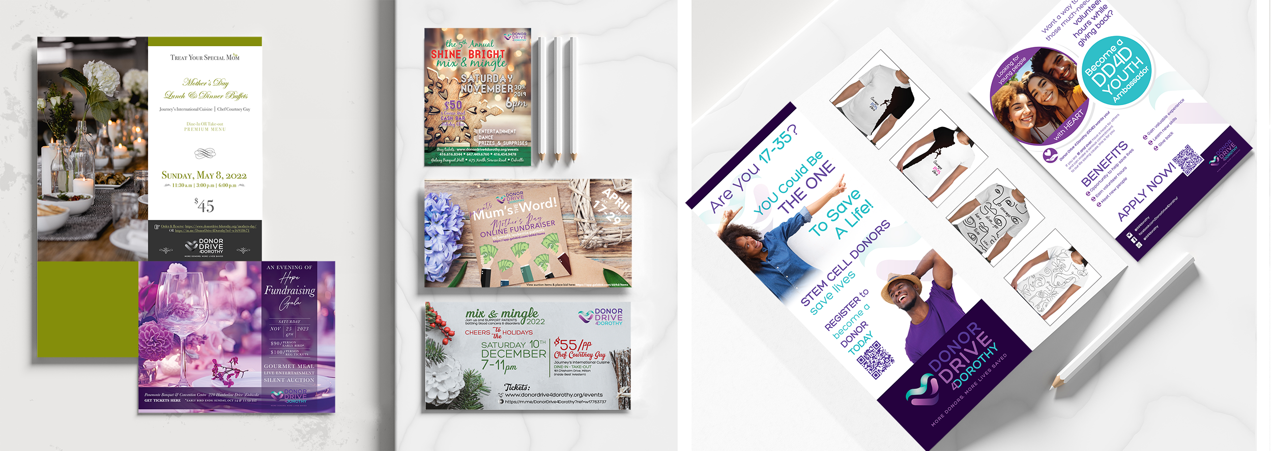
Client: Donor Drive 4 Dorothy (DD4D)
Challenge: To elevate the DD4D brand identity to coincide with this charity’s growing efforts be better recognized & be awarded any funding available in their space for non-profits.
Solution: A re-fresh was the necessary solution to tackle their image of being a “small charity” and not getting the support they needed to promote their worthy cause. After using our “IT WORKS” branding process we created a succinct combination logo that clearly spoke to their blood donation cause using a custom & unique flowing heart icon with clean, bold sans-serif font in all caps. The new colours were largely based on the info gleaned from our workshops that pointed to a more modern approach at health.

